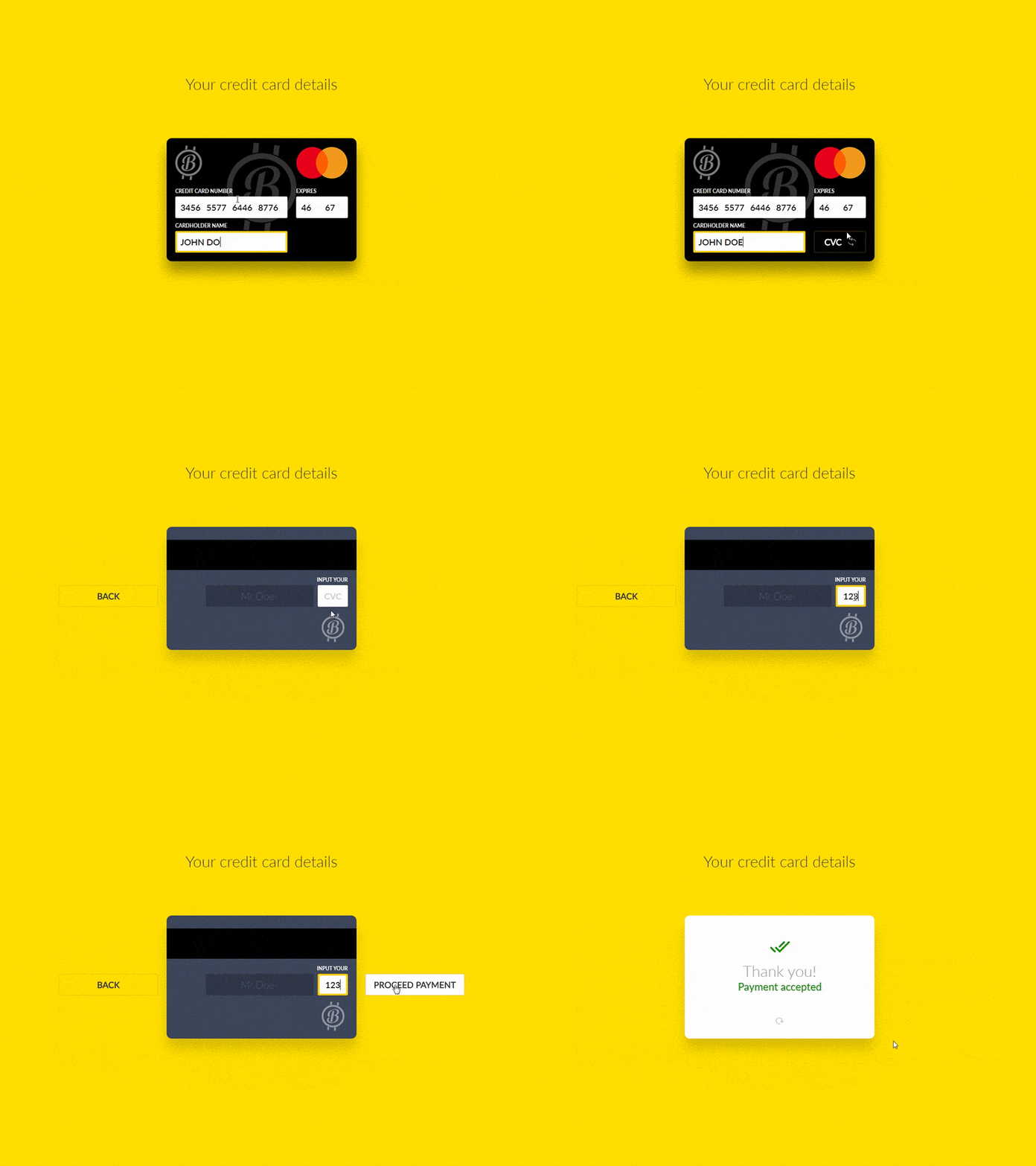
Case study: browser payment input card with animation
This article tells about rather an easy way to design interactive elements almost immediately in the browser

Interface animation is in trend now. There are several reasons: improving usability and increasing the attractiveness of the product in general. And the third one is the development of tools to animate in the global IT market. These days there are so many different utilities to animate any design / prototype, that it would be strange to pass by such a trend, it`s necessary to acquire the skills. There are too many tools many to list them all. But I will mention a very special one…
I work in Axure. The biggest plus for me in it was the possibility to create interfaces almost immediately in the browser. I see all the elements, fonts, indents right in “air alert”, barely having time to introduce them to the layout. I know that the developers will see them the same way. I know that in 99% of cases nothing “will break” in the design.
Today I`m telling about how to make a simple interactive / animated payment details form. I must say that the creation of animation in Axure is not quite standard. There is no usual timescale with the projection on the layers, as in After Effects. There is only sequence of events that is started with a specific action. Between them you can paste “Delay” timings and specify a pause in milliseconds. Animating in Axure seems a bit geeky: you will be able to learn it, only if you are deeply imbued with the process itself.
Live preview http://www.cardinteractive.pro/demo
I`ve made up this task myself, just to acquire the skills. I appreciated the flip-effect and searched for items from the real world, which can best fit this animation. What do we turn over in our hands most often to see the contents of the reverse side? Credit card fits perfectly. We enter the data from the front side, then turn it over to enter the CVC code. I have long held the position: the animation on electronic devices needs to be justified by the physics of the real world. Then we like it and it doesn`t seem to be annoying. We hardly notice it, it just happens. And the product leaves a warm feeling when the work is through. So well thought-out animation works on usability. That’s why it’s important and that`s why it’s trending.
Case: interactive form of a credit card data entry
Task: make a convenient browser-based version of a credit card with all the necessary inputs, conversions between them and clear animation to improve usability.
Bonus: Axure source in *.RP file will be found at the very end + HTML/CSS code either.
Action plan
- make a simple and attractive design
- imitate the card type identification after you enter the first 4 digits (e.g., Mastercard)
- automate refocusing between input fields of different data (e.g., Cardholder input focus after entering the card expiry date)
- promptly offer CVC code input on the back side, after entering the full name
- try to get rid of possible excessive action by the user (for example, less clicks in the obvious places)

General concept
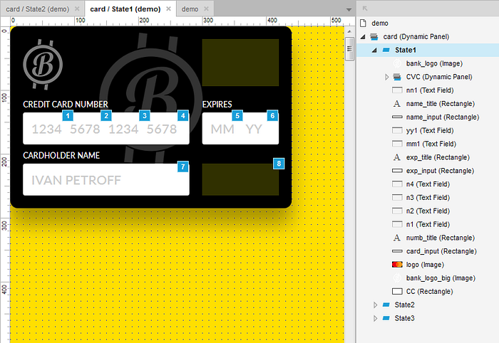
The basis of the source is a dynamic panel, consisting of 3 States. The front side (State1), reverse side (State 2) and additional side (State 3) with the confirmation that the data have been accepted. Within each sub-group State1…3 there are the design elements.
Design
For web interface I always use a 10px grid — I prefer to count the indents and dimensions this way. So I tried to make them multiples of 10. The logo is temporary, I did not want to mention the names of existing banks. The card casts a shadow down at an angle of 90 to add a little feeling of the space. Shadow settings: x=0, y=25, blur=45, #000000, alpha=0.35
The front side (State1)

Contains graphics, the hidden Mastercard logo, hidden button of card reversal to enter the CVC code (8). These two objects will appear under certain conditions. And the conditions test will be tied to events. For example, if the length of the data entered in the Cardholder name field is greater than or equal to 7, then we show the reversal and CVC entering button on the reverse side. Of course in real life the developer will verify the completion of all fields, but in my case it is excessive perfectionism.
Input fields (1–7) are two-component. It`s a little weird, but Axure does not allow too much space with CSS for html inputs. It`s good that we can disable the border and give it a more modern look. Therefore, there is an additional white rectangle under inputs and they are the priority above and with the “Hide border” checkbox. This rectangle will change the style at the onFocus time on the input, so no one will know about the use of two related objects.
The reverse side (State2)

Here everything is simple. “Magnetic” band is held for more realism by using the same rectangle drawer. Here is only the CVC field from the important controls. The payment confirmation button is hidden behind the card body. It moves with a bounce-effect (actually a simple ease would be enough) only after verifying the “characters in the CVC field >= 3” condition.
Confirmation side (State3)

And the most simple is “Side 3”. When the card is turned around it seems to be back, but the content is different. This is the side of the positive experience confirmation. Everything has come well. There is the minimum of elements. There are no functions or events. Such an effect should add appeal to the overall composition, in addition to the positive impact on user experience.
Identifying the card type
This is imitation of payment service recognition after entering the first 4 digits. Since this is only a prototype, I’m using the onLostFocus function for the first input of the card number + verification of the content. If “content = true” and focus moves to the following 4 digits, then we show the logo.
Refocusing to the next input
Is due to the onTextChange function. After each entered digit, we check the number and if there are 4 of them, we separated them by a space. Visually it looks that way, but technically I had to complicate everything much. Why, you will learn below in the Known bugs. I think there is something to improve, but the general appearance will not change. I`ve decided that potentially spent time isn’t worth it. The movements between the other fields (for example a jump from the date to the full name) are made on the basis of OnTextChange.
The reverse side of the card and CVC enter
I give the opportunity to turn the card back and fill in the last field, only after checking at least part of the name on the input. I check it with the onKeyUp function. That is, whenever we release the button on the keyboard, the program checks the conditions and if something is entered there appears the card reverse button. The ideal is to check the Cardholder field clear and then to hide the button. But we`ve agreed: no perfectionism.
UX
• I refused the need to click card reverse button. I think that if a user reached out to it, he is aware that the rest is filled in correctly. The button works with hovering.
• Similarly we don1t need the click to focus on the CVC field. It`s enough just to hover the cursor. The solution is not perfect. I gave the reason below…
• The payment confirmation button “flies up” to the right of the card. Thus animation shows the cause-and-effect relationship and the less path of the cursor from the CVC input to the button.
Known bugs
• If you enter the card number very quickly, then the autofocus on the following 4th digits starts to jam. The similar situation is with the deletion. A solution would be to leave only one input and somehow to teach Axure put a space after each 4 digits of the card number, but I failed to do this. That`s why I used 4 independent inputs only for the sake of convenience of entering the card number thanks to the gaps.
• I couldn’t do autofocus on CVC at the card reversal. I just couldn`t associate the onPanelStateChange function synchronously with the check that we are now in State1 (and only in it). Ideally, I would like to do this: check that there is a turn to State2, wait for delay=100 and then autofocus the CVC field, but alas. As a half-measure, the focus only works with onHover. But I still do not force anyone to trudge there with the mouse:(
FREE download HTML/CSS/JS code for Interactive Card • Gumroad. This version is free, including for commercial purposes. There is only one request: if you have successfully integrated this interactive form to your product, please leave a link to the project here in the comments. Thank you.
$2 for Axure RP source file with Interactive Card • Gumroad
It worth the price above for your learning purposes
