Material design charts and Data visualization encyclopedia
Extended charts design kit for Figma has been published, so I can summarize now all types of graphs and diagrams I’ve designed recently
Since I’ve finally shipped the extended version of charts design kit for Figma I become more skilled to crafting and combining components for producing high fidelity prototypes for dashboards, analytics products, presentations, data design & visualization projects. And this post is the source of inspiration for those who involved in designing charts as well. Hope you will find it useful in case I am planning to update this post with new layouts regularly.
Bar chart
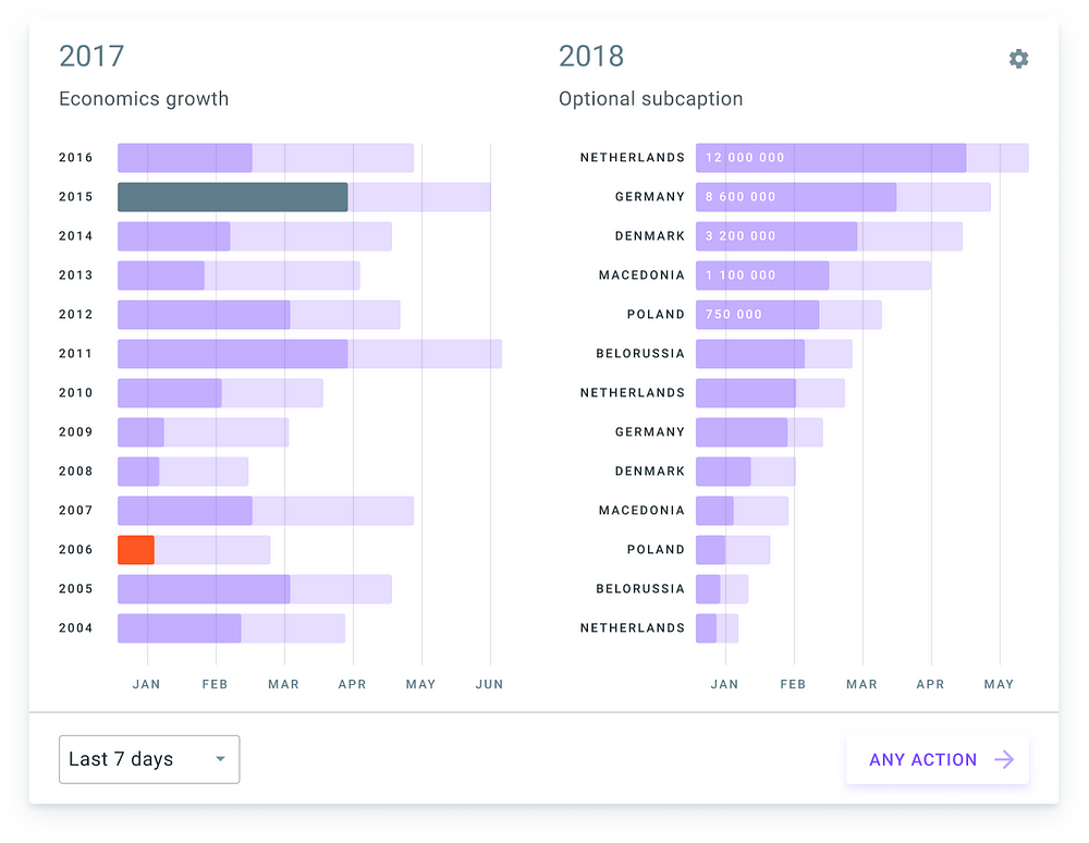
A bar chart or bar graph is a chart or graph that displays categorical data with rectangular bars with heights or lengths proportionate to the values that they describe. The bars can be framed vertically or horizontally.
Column chart
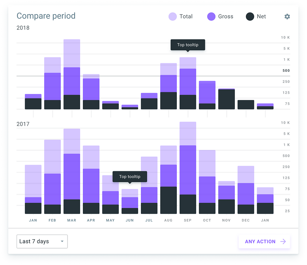
A column chart is a graphic representation of data. Column charts display vertical bars going across the chart horizontally, with the values axis being displayed on the left side of the chart.
Histogram
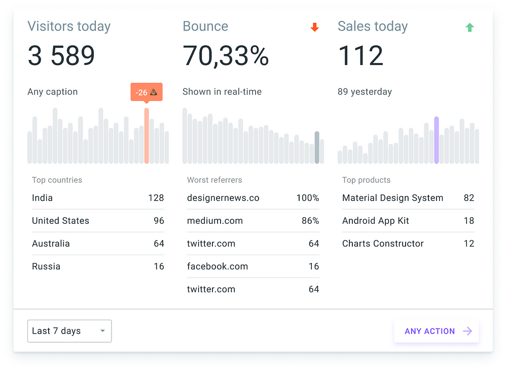
A histogram is an accurate representation of the distribution of numerical data. It is an estimate of the probability distribution of a continuous variable (quantitative variable).
Heatmap
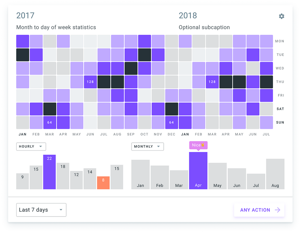
A heat map (or heatmap) is a graphical representation of data where the individual values contained in a matrix are represented as colors. Also known as shading matrices which have existed for over a century.
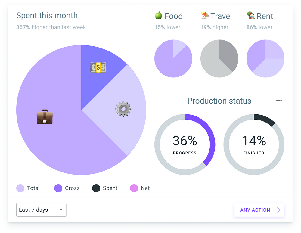
Pie & Circular charts
A pie chart (or a circle chart) is a circular statistical graphic, which is divided into slices to illustrate numerical proportion. In a pie chart, the arc length of each slice (and consequently its central angle and area), is proportional to the quantity it represents.
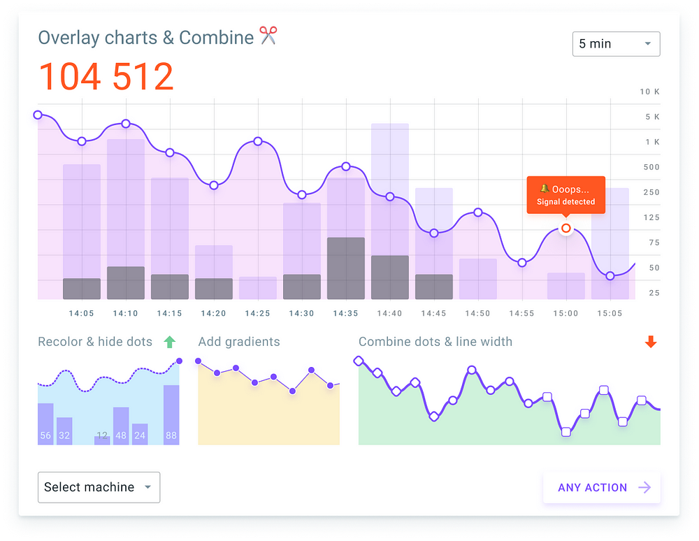
Line & Wave charts
A line chart or line graph is a type of chart which displays information as a series of data points called ‘markers’ connected by straight line segments. It is a basic type of chart common in many fields.
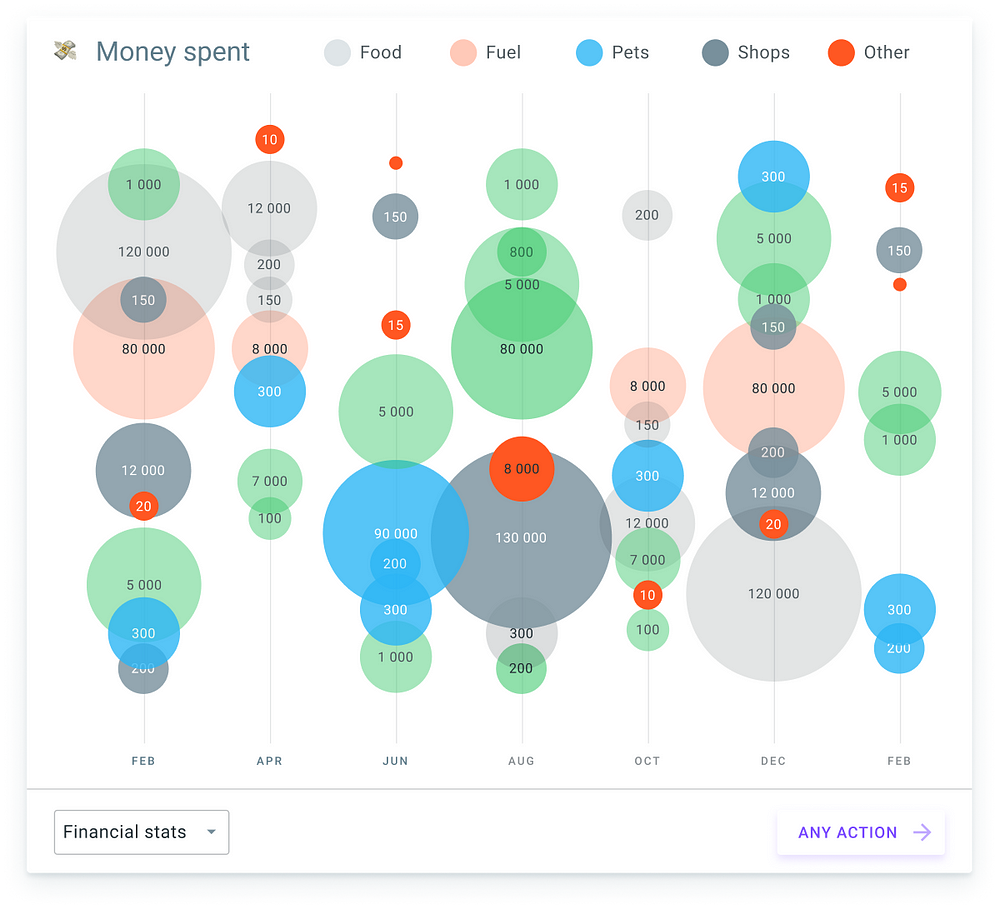
Bubble charts
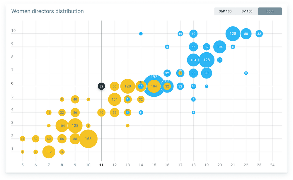
A bubble chart is a type of chart that displays three dimensions of data. Each entity with its triplet (v1, v2, v3) of associated data is plotted as a disk that expresses two of the vi values through the disk’s xy location and the third through its size.
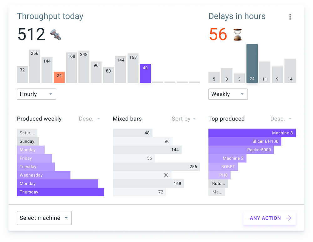
Labeled bars
Labeled bars contains a text caption to display the caption for every item. Text could be aligned to the left, right, top or bottom position inside a bar.
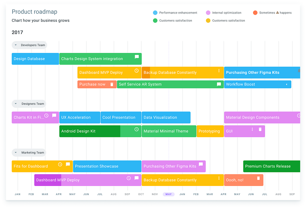
Roadmap charts
Roadmaps are essential for coordinating the product development process. They ensure that ongoing day-to-day tasks align with and contribute to your higher level business strategy.
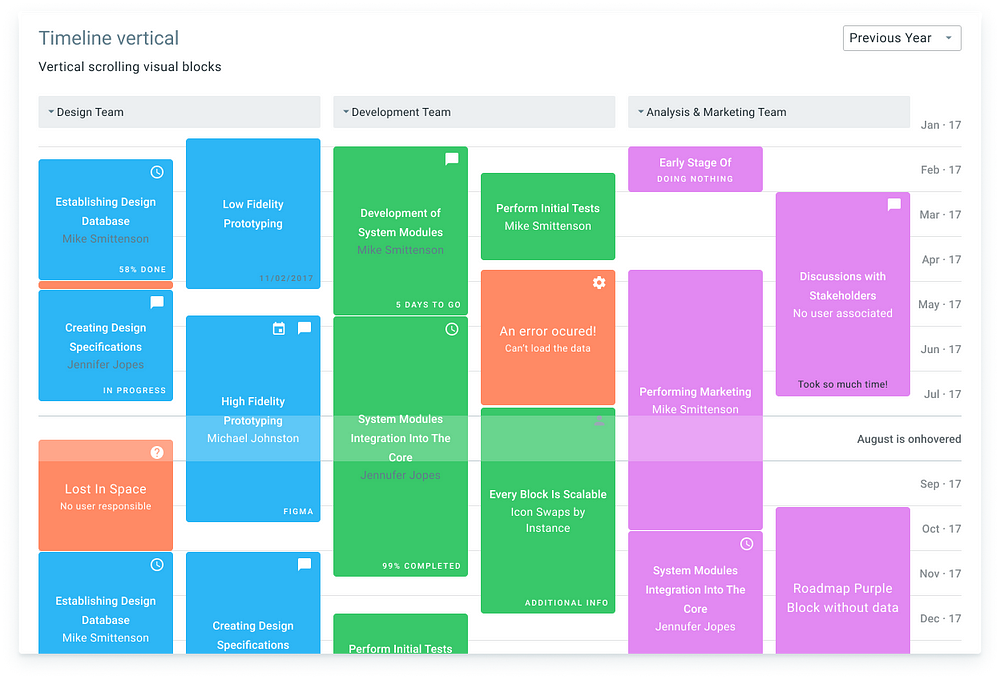
Timeline charts (vertical example)
A timeline is a type of chart which visually shows a series of events in chronological order over a linear timescale. The power of a timeline is that it is graphical, which makes it easy to understand critical milestones, such as the progress of a project schedule.
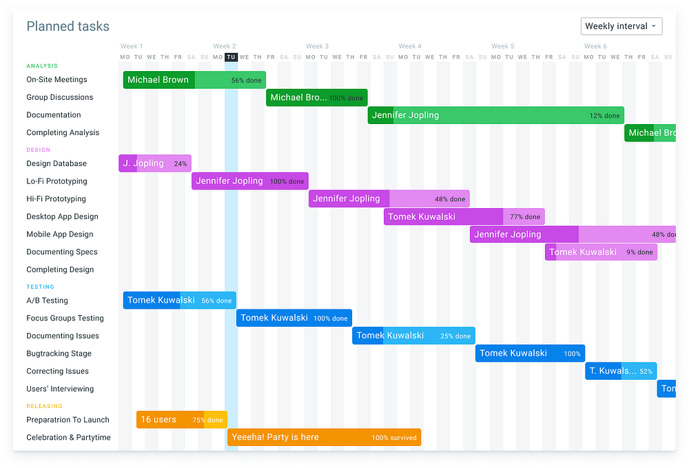
Gantt for Task Management
A Gantt chart is a type of bar chart that illustrates a project schedule, named after its inventor, Henry Gantt, who designed such a chart around the years 1910–1915. Modern Gantt charts also show the dependency relationships between activities and current schedule status.
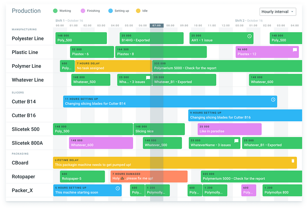
Gantt for Production
This generic production Gantt chart example shows what a typical manufacturing process might look like. Using a Production chart to layout out the steps involved in manufacturing helps streamline the project, maximizing throughput
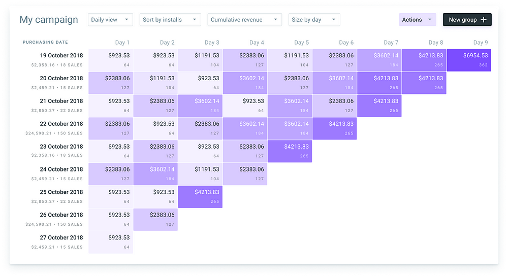
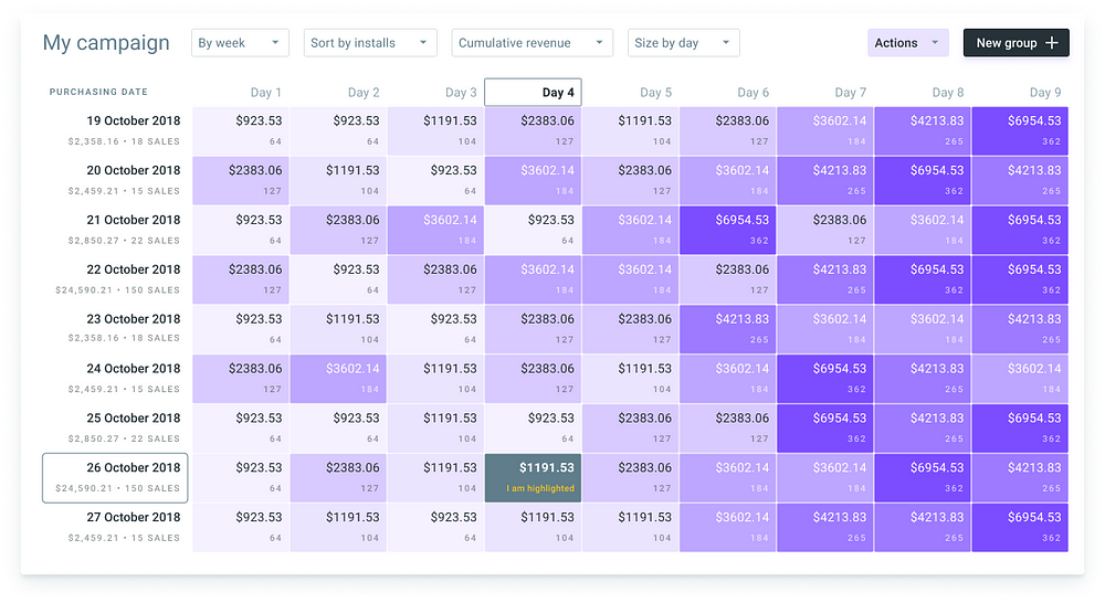
Cohort charts
Cohort analysis is a subset of behavioral analytics that takes the data from a given dataset and rather than looking at all users as one unit, it breaks them into related groups for analysis. These related groups, or cohorts, usually share common characteristics or experiences within a defined time-span.
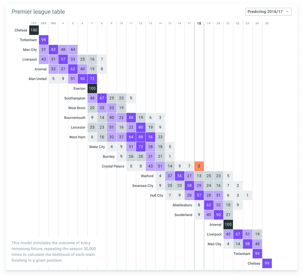
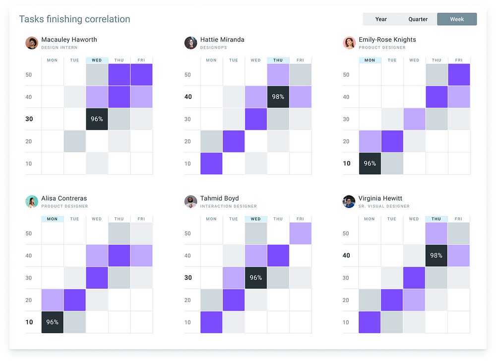
Matrix charts
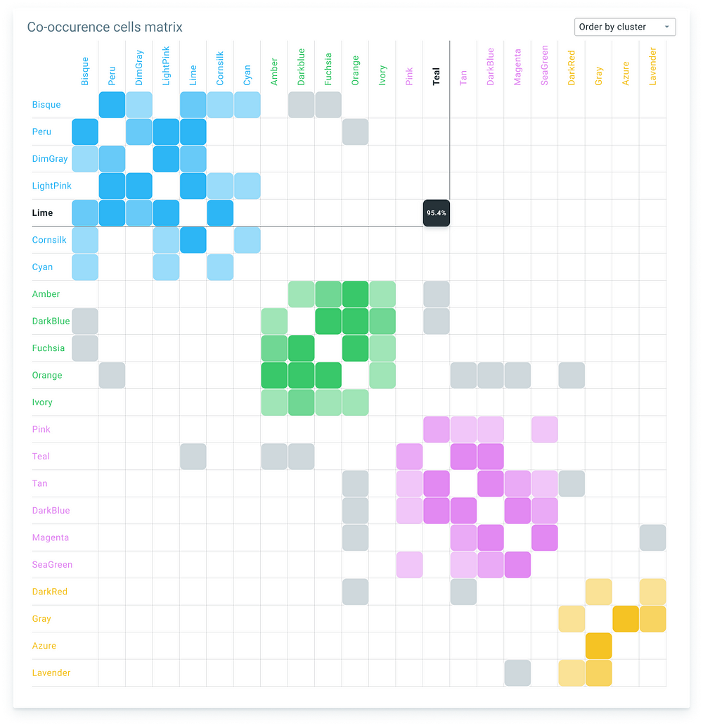
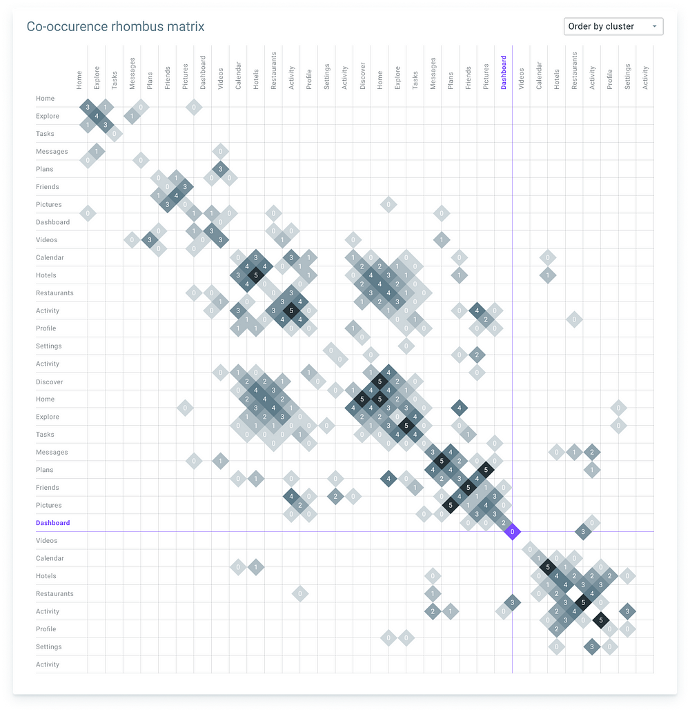
Matrix chart shows relationships between two or more variables in a data set in grid format. Essentially, the matrix chart is a table made up of rows and columns that present data visually and can be seen as the visual equivalent of a crosstabulation that divides data between the variables.
Hexbin charts
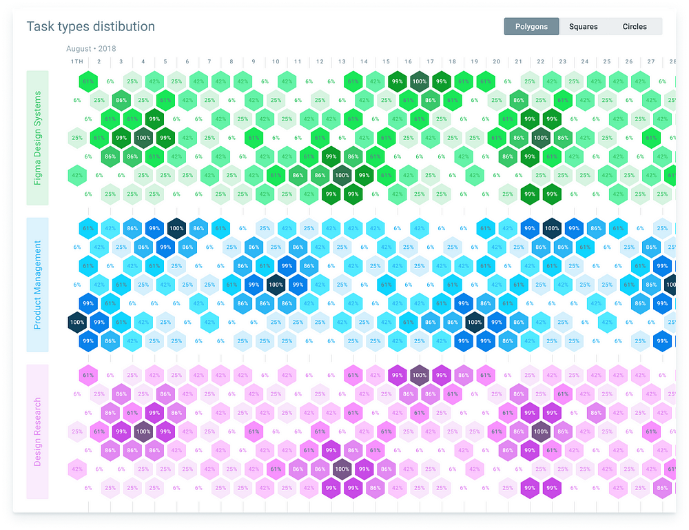
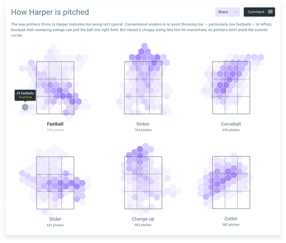
Binning is a technique of data aggregation used for grouping a dataset of N values into less than N discrete groups. The simplest binning method uses hexagon tiles instead of classic squares, and for most purposes this suffices, taking advantage of its computational simplicity.
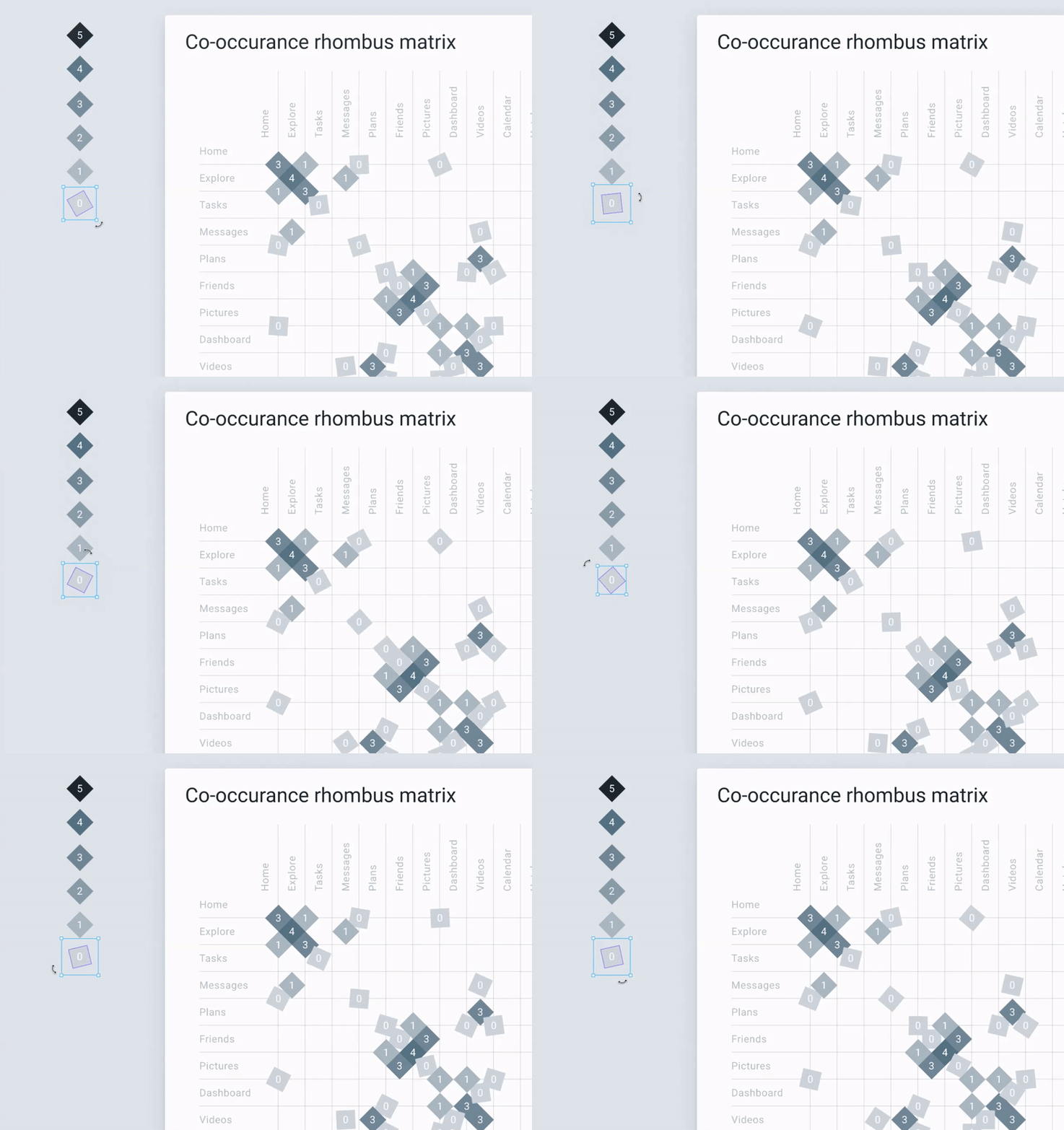
Co-occurrence matrix
A co-occurrence matrix or co-occurrence distribution is a matrix that is defined over an image to be the distribution of co-occurring pixel values at a given offset. The offset, is a position operator that can be applied to any pixel in the image: for instance, could indicate “one down, two right”.
Distribution plot
The distribution plot is suitable for comparing range and distribution for groups of numerical data. The distribution plot visualizes the distribution of data. It is not relevant for detailed analysis of the data as it deals with a summary of the data distribution.
Scatter plot
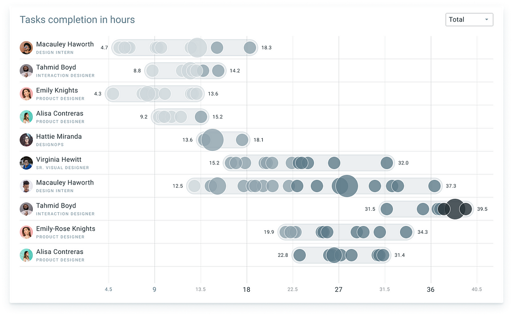
A scatter plot is a two-dimensional data visualization that uses dots to represent the values obtained for two different variables — one plotted along the x-axis and the other plotted along the y-axis. For example this scatter plot shows the height and weight of a fictitious set of children.
Bullet graph
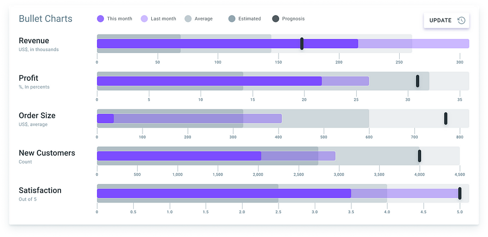
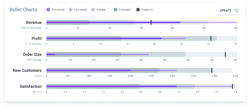
A bullet graph is a variation of a bar graph developed by Stephen Few. Seemingly inspired by the traditional thermometer charts and progress bars found in many dashboards, the bullet graph serves as a replacement for dashboard gauges and meters
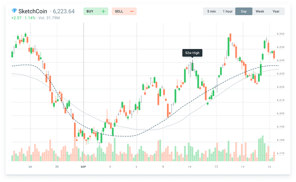
Financial charts
A candlestick chart (also called Japanese candlestick chart) is a style of financial chart used to describe price movements of a security, derivative, or currency. Each “candlestick” typically shows one day, thus a one-month chart may show the 20 trading days as 20 “candlesticks”.
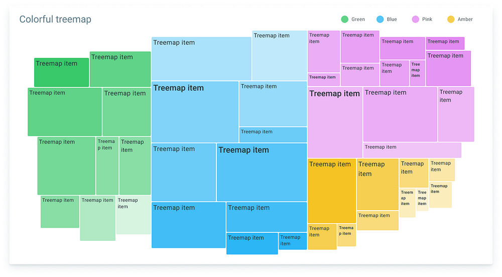
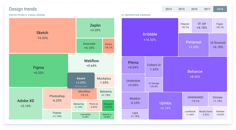
Treemapping
In information visualization and computing, treemapping is a method for displaying hierarchical data using nested figures, usually rectangles.
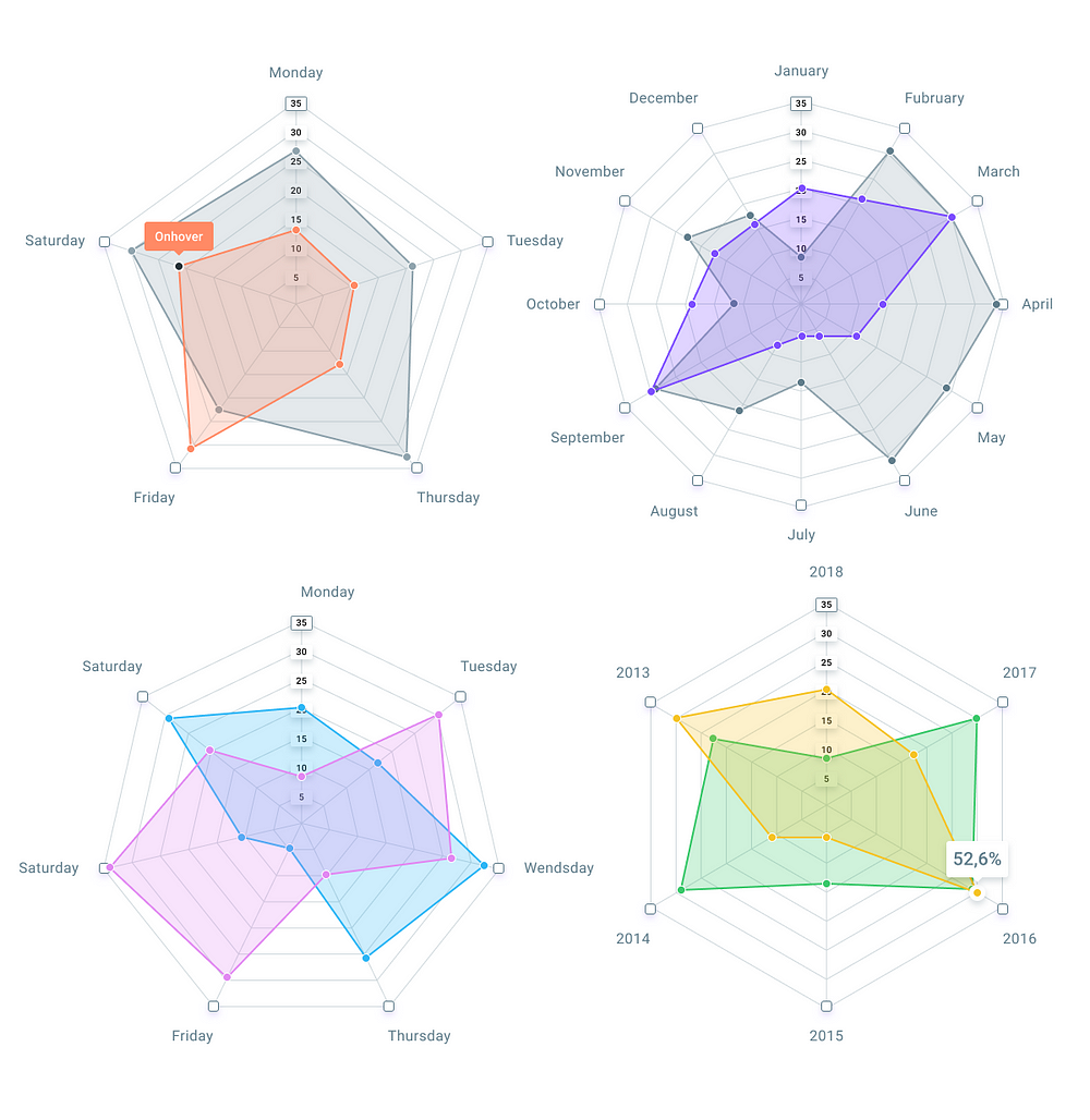
Radar charts
A radar chart is a graphical method of displaying multivariate data in the form of a two-dimensional chart of three or more quantitative variables represented on axes starting from the same point. The relative position and angle of the axes is typically uninformative.
Spie charts
A variant of the polar area chart is the spie chart designed by Dror Feitelson. This superimposes a normal pie chart with a modified polar area chart to permit the comparison of two sets of related data. The base pie chart represents the first data set in the usual way, with different slice sizes.
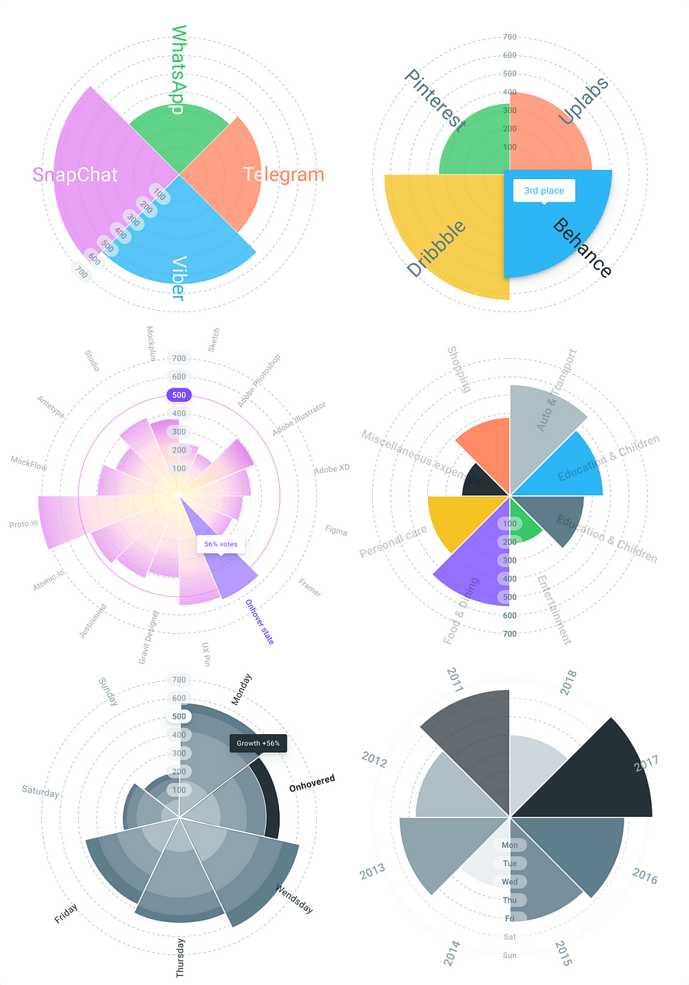
More charts to come soon and this post will be updated…
Powerful templates to design the data
Take your analytics, dashboards and data visualization to the next level. Basic kit contains the common charts for crafting visually balanced dashboards, presentations, statistics and every project where you need to analyze the data.
And extended charts design system is suggested for crafting clear and beautiful data design projects, infographics and every product to examine statistics and analytics.
Built from components aimed at flexibility
Exceptionally established from components, this charts kit offers ultra easy for designers, developers, and engineers to create quickly customizable and clear diagrams for any kind of project with the purpose of examining big amounts of statistics. Crafted with attention to every little detail this Material Design Charts kit absolutely fits 8dp grid and developed with acknowledged gutters and margins. Every template set with decent constraints, so it’s endless resizing and feels like responsive.
What’s inside the charts kit?
32+ charts design templates in total: Columns, Bubbles, Histograms, Horizontal & Vertical bars, Heatmaps, Pie & Circular charts, Labeled bars, Line & Wave charts, Matrix charts, Treemaps, Bullet charts, Distribution plots, Financial candlestick charts, Cohort charts, Gantt, Hexbin, Radar & Polar charts and many many more…
Charts on request feature
I am always looking for new tasks to enhance this product. If you had purchased this kit and require an extra special graph for your project, simply drop me a line. I ship fast and updates are for free.
